Week 1: Implement the Navigation Bar
In this section, we will delve into the basics of HTML and CSS to create a functional and visually appealing navigation bar for our website. You'll learn how to structure your navigation bar in HTML and style it effectively with CSS, including an introduction to the Flexbox layout model.
In this chapter, you will learn
Task of our project
Whether you're just starting to write your very first page or already experienced, the first step should be to think about the content of the page and decompose the mockup into small pieces. Generally speaking, we can disassemble the page into multiple modules in a top-to-bottom order, gradually describe each module with HTML, and finally add styles with CSS.
You can either write all the HTML at once or implement one module, add styles to it, and move on to the next one. Here, we'll implement the first page in small chunks at a time to prevent learning too much at once.
Deconstructing the mockup
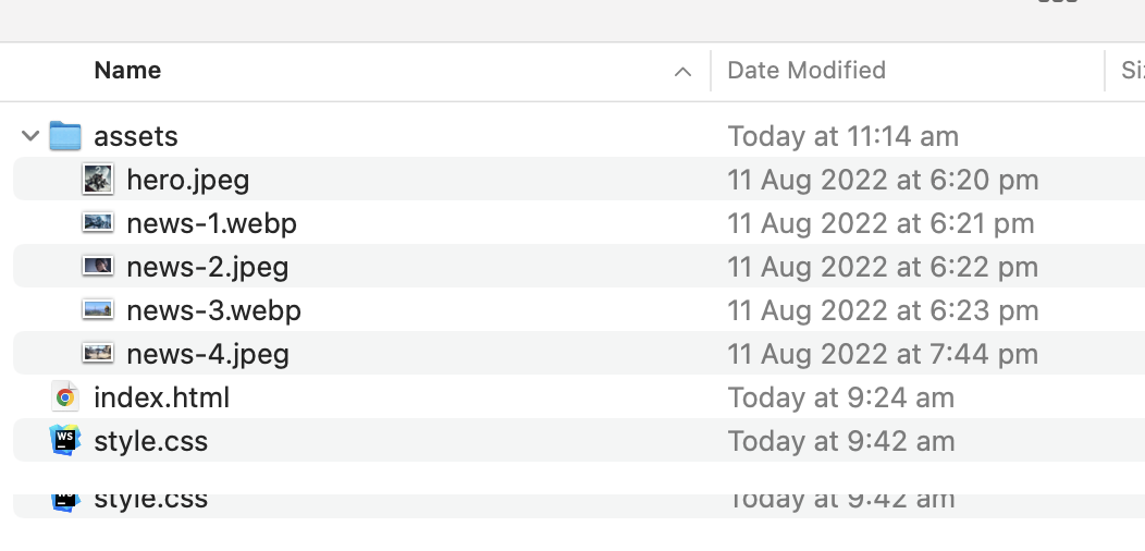
As seen from the mockup, the navigation part of it is a relatively independent component, so we can start from it. Let's do some preparatory work first, create a directory week-1, and create two files index.html and style.css in it. Finally, we create a subdirectory of assets in week-1 for image resources.

In index.html we need to set some basic HTML code, aka boilerplate HTML:
<!DOCTYPE html>
<html lang="en">
  <head>
    <meta charset="UTF-8" />
    <meta http-equiv="X-UA-Compatible" content="IE=edge" />
    <meta name="viewport" content="width=device-width, initial-scale=1.0" />
    <link rel="stylesheet" href="style.css" />
    <title>Week 1</title>
  </head>
  <body>
    <!-- our code goes here -->
  </body>
</html>
If you're unsure of what's described here, don't worry, we'll barely touch this part. The Week 1 defined in the title tag will appear in your browser tab, so give it a cool name if you like.
We'll be working in the body area throughout this chapter (including the entire book), all of our HTML code will be written inside it (almost, we may need to add external CSS links, but we will talk about it later).
Additionally, the statement <link rel="stylesheet" href="style.css"> indicates that we wish to use an external file in this HTML document: style.css. Yes, this is where we define the styles, but this file doesn't have anything yet.
Now uou can start the Live Server in Code (by clicking the Go Live button on the status bar). Once the page is loaded in browser, type some text into body, and you should be able to see the browser page refreshed with the edits. By default, There will be a one second delay.
Implement the navigation bar
Let's start with the HTML of navigation bar. HTML is a very loose, inclusive language compared to other programming languages. Looseness means that there are many different ways to implement a component. For example, you can use div to represent a logical container on the page, and you can also use article or section to achieve the same purpose.
In practice, however, we need to use semantic tags, such as h1-h7 for titles, p for paragraphs, and article to hold a relatively independent item and so on.
For the navigation bar, HTML has a nav tag available, and for the list content in nav, we can use an unordered list ul or an ordered list ol. Since nav is in the header of the page, we can use header as the container for the whole navigation.
<header>
  <nav>
    <ul class="nav-list">
      <li class="list-item">
        <div class="logo"><span class="highlight">Game</span>Insider</div>
      </li>
      <li class="list-item">
        <a href="#">News</a>
      </li>
      <li class="list-item">
        <a href="#">Videos</a>
      </li>
      <li class="list-item">
        <a href="#">Reviews</a>
      </li>
      <li class="list-item">
        <a href="#">Staff picks</a>
      </li>
      <li class="list-item">
        <a href="#">Deals</a>
      </li>
      <li class="list-item">
        <button class="button-primary">Login</button>
      </li>
    </ul>
  </nav>
</header>
There are seven items in the navigation bar. Five hyperlinks are in the middle, and the first one is an icon and the last one is a button. To help CSS to select specific elements, we need to add the attribute like class= "xxx" (and use .xxx to refer it) to some elements.

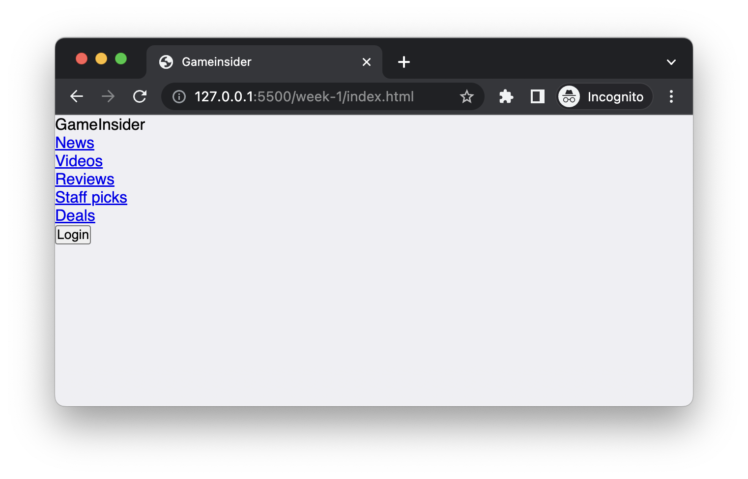
By default, browsers add a bullets to all lis, as well as some spacing to ul for easier reading. Browsers always assume that the page is usable without any CSS. We need to override these default styles via CSS:
* {
  margin: 0;
  padding: 0;
}

body {
  font-size: 16px;
  font-family: "Open Sans", sans-serif;
}

li {
  list-style: none;
}
Here, * is a special selector, which means to select all HTML elements on the page. And for all these selected elements, we apply two rules, margin:0 to eliminate the outer space, that is, no outer padding; padding:0 means eliminate padding, that is, there is no space between the element content and the border.
Similarly, we use the tag type body to select the main content area, set the font size to 16 pixels, and use the font Open Sans (if Open Sans is unavailable, the system default sans-serif font sans-serif is used) .
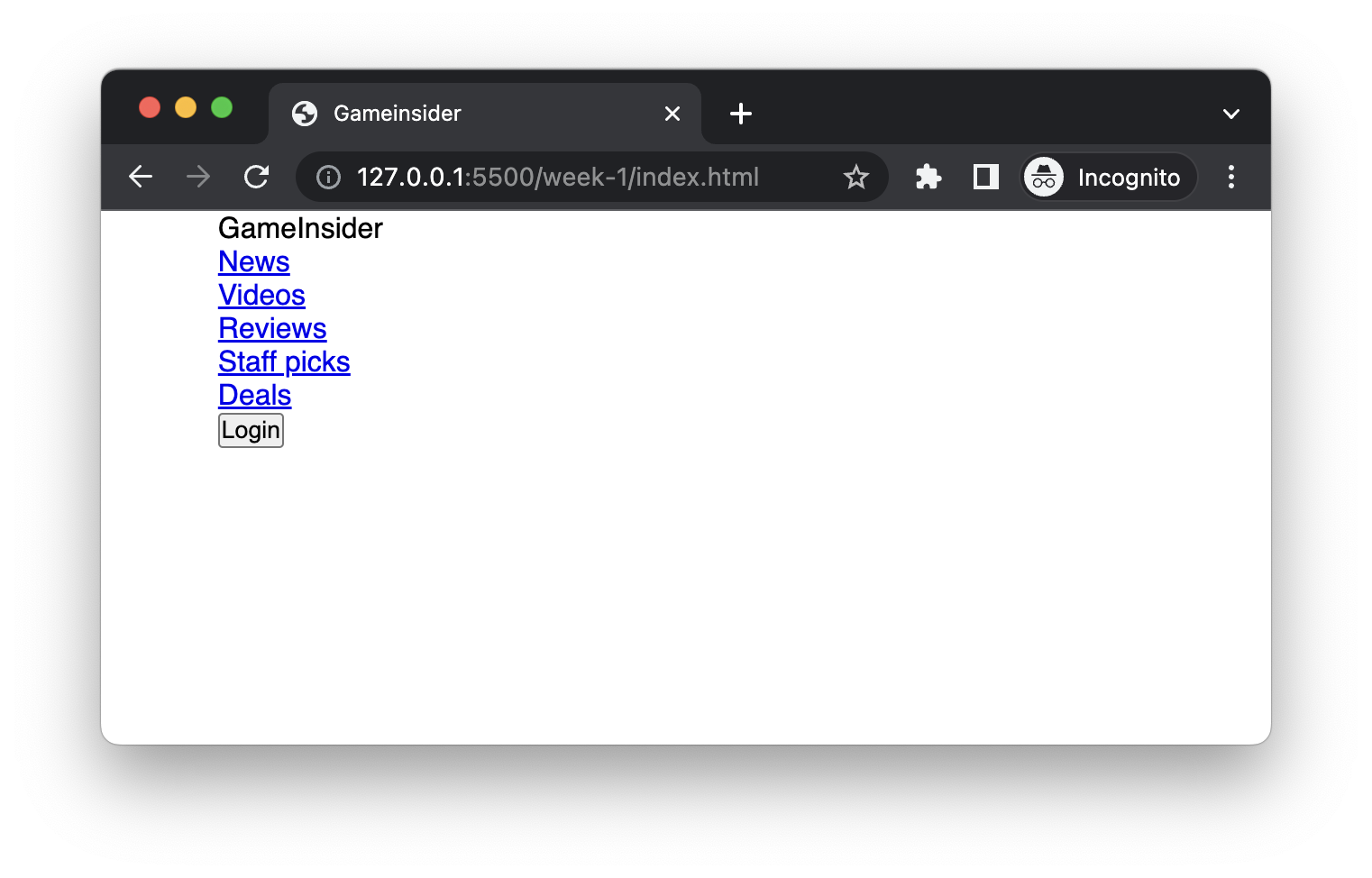
Additionally, we want the entire navbar to be centred on the page and have a width of 80% of the available area:
nav {
  width: 80%;
  margin: 0 auto;
}
Next, we want the seven elements in the navigation to be arranged horizontally, not vertically. Here we have to mention two different elements in HTML: block-level elements and inline elements (strictly speaking, there are more than two in HTML, but we will only describe the two most common ones here). Block-level elements occupy a single line by default, no matter how wide their actual content is. Inline elements keep the content on the same line.
<div class="container">
  <p>This</p>
  <p>is</p>
  <p>a</p>
  <p>sentence.</p>
  <span>This</span>
  <span>is</span>
  <span>another</span>
  <span>one.</span>
</div>
For example, since p is a block-level element by default, it will be on its own line. And span will stay on the same line. Since most HTML elements are block-level elements, they render as many lines by default.

We can use flex layout to override this default behaviour. flex one of the layout mechanism in CSS. I'm not going to cover all flex properties here (because that is almost a book in itself), and we will only cover a few common ones here.
First, to use the flex layout, we need a container element, and then set the container's display to flex:
.nav-list {
  display: flex;
}
Immediately, all elements became one line like a magic!

Next, we make some spacing adjustments, making sure the Login button is on the right, and the logo is on the left, and the other links are relatively centred:
.list-item:last-child {
  margin-left: auto;
}

.list-item:first-child {
  margin-right: 32px;
}
The .list-item:last-child selector here will select the last child node with the class .list-item, and similarly, :first-child will select the first child.

For hyperlinks, browsers will add a lot of styles by default, such as the underline and bright font colours. According to the mockup, we need to override these styles as well:
.list-item a {
  padding: 0 8px;
  text-decoration: none;
  color: black;
  white-space: nowrap;
}
The .list-item a selector means to look for the a (hyperlink) tag in the child nodes of .list-item. CSS selectors are parsed from right to left, this selector when interpreted will first look for all a, then see if there is .list-item in its ancestor node, and then decide whether to apply these CSS rules or not.

Next, let's customise the button, which has rounded corners and some white space between the text and its border. White space is very important in design. Enough white space can make reading easier and make the page more attracting.
.button-primary {
  appearance: none;
  border: 1px solid blue;
  padding: 4px 16px;
  border-radius: 16px;
}
Usually, the logo will be an image element, but we simply use some texts to simulate it here. We need to use a thicker font and highlight the Game colour:
.logo {
  font-weight: bold;
}

.highlight {
  color: blue;
}
In this way, the logo looks the same as the mockup.

But if you look closely at the button, it doesn't align with other elements (like the red line in the image above). Alignment is another extremely important principle in design (we'll cover that in chapter three), and our brains prefer neat arrangements over disorder. In fact, horizontally aligning elements inside a container has historically been super difficult, but this problem is easily solved using flex layout.
On a flex container, just use align-items, and set it as center:
.nav-list {
  display: flex;
  align-items: center;
}
Also, let's add some extra whitespace to the navigation bar to give him more breathing room:
.nav-list {
  display: flex;
  align-items: center;
  padding: 16px 0;
}
Here is how the "final" navigation bar looks like now:

It is the time to take a quiz
We are now very close to the mockup, although it's not pixel prefect. Even better, using the flex layout, our navbar will still work well on wider screens, like the button will always be on the right side of the page, pretty cool right?

You have Completed Chapter 4
Great job on completing this chapter! You now have a well-designed navigation bar, setting a solid foundation for your website's layout.
Next up, we'll move onto the 'Hero Banner' section, where we'll apply our HTML and CSS skills to create an engaging and visually striking first impression for our website.