Optimizing User Experience with Skeleton Loading in React
This chapter offers a detailed walkthrough on enhancing user experience in React applications by implementing skeleton components. Learn how to create and use these components to provide users with a visual cue during data loading, reducing perceived wait times and improving interaction.
In this chapter, you will learn
In this chapter, we will look into the loading indicator, there are two common ways of showing the users that something is happening and we can not show the data right away: skeleton and spinner.
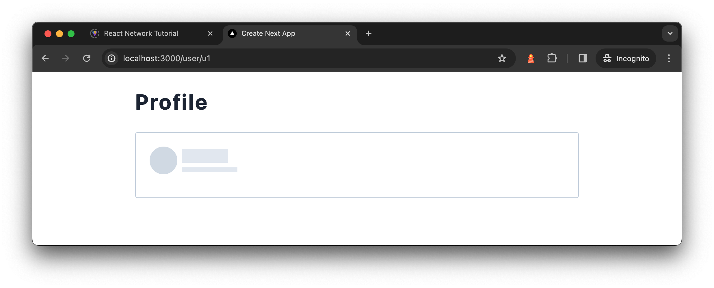
A skeleton component is a user interface design used to indicate data loading, where a placeholder mimicking the actual content layout is displayed. These are usually grey blocks or lines that show where and how the final content, like text or images, will appear. The skeleton component enhances the user experience by reducing the element of surprise during loading, providing a preview of the content's structure.

On the other hand, a spinner is a more generic loading indicator, often a circular animation, signifying that an operation such as data fetching or processing is in progress. Unlike skeleton components, spinners do not give any hint about the content's layout or the loading duration.
The main difference between the two lies in the level of context they offer. Skeleton components provide a glimpse of the content's layout, making the loading process feel more integrated and smoother. In contrast, spinners are used when the exact content layout is unknown or the loading time is brief, serving as a universal sign of an ongoing process without specific layout information. Skeleton components are about enhancing the user experience with specific layout anticipation, while spinners are more about universally indicating activity.
Skeleton is surprisingly easy to implement, let's see how we can make one for the About component when the content is loading:
function AboutSkeleton() {
  return (
    <div className="flex flex-row gap-2 pb-4 items-center animate-pulse">
      <div>
        <div className="w-12 h-12 rounded-full animate-pulse bg-slate-300" />
      </div>
      <div className="flex flex-col gap-2">
        <div className="text-2xl font-bold w-20 h-6 bg-slate-200" />
        <p className="text-xs w-24 h-2 bg-slate-200" />
      </div>
    </div>
  );
}
The AboutSkeleton component creates a row layout with centered items and a gap between them. The animate-pulse class applies a shimmering animation effect. The component includes a circular shape to mimic an avatar and two rectangular blocks to represent text lines, all with different shades of gray for a placeholder effect. The use of Tailwind CSS classes like flex, gap-2, rounded-full, and bg-slate-300 controls the layout and appearance, ensuring the skeleton mimics the structure of the content it represents.

This placeholder doesn't need to be perfect but should give an idea of the actual component’s layout. Aiming for a close height match with the actual component can help in reducing CLS (Cumulative Layout Shift).
Cumulative Layout Shift (CLS) is a metric used to quantify how much elements on a webpage move around during loading. It's part of the Core Web Vitals, a set of metrics from Google designed to measure user experience on web pages. CLS specifically measures the stability of a page as it loads, with a focus on how unexpected layout shifts can affect a user's experience.
For those interested in a hands-on guide, my video demonstrates creating a skeleton component from the ground up:
Key takeaways for creating custom skeleton components are:
- Choosing subdued colors for the background shapes
- Aligning the size and position of placeholders as close to the actual UI as possible
- Employing animation to convey a dynamic
loadingstate
You have Completed Chapter 9
This chapter closes our exploration of enhancing user interfaces in React with skeleton loading. We've covered design principles, implementation techniques, and best practices. Next, we'll shift our focus to server-side technologies for further performance improvements.
As this chapter concludes, we encapsulate the essence of effective loading indicators and set the stage for the next chapter on server-side technologies.
Subscribe
Get new posts and tutorials in your inbox via the newsletter.
Subscribe