Optimizing Friend List Interactions
Chapter 4 focuses on enhancing the user experience in React applications by implementing a detailed user profile popover. It explores the integration of external UI libraries like NextUI for building interactive features and discusses efficient data fetching strategies.
In this chapter, you will learn
Let's delve further into typical frontend application scenarios, uncovering new patterns and potential avenues for performance improvement.
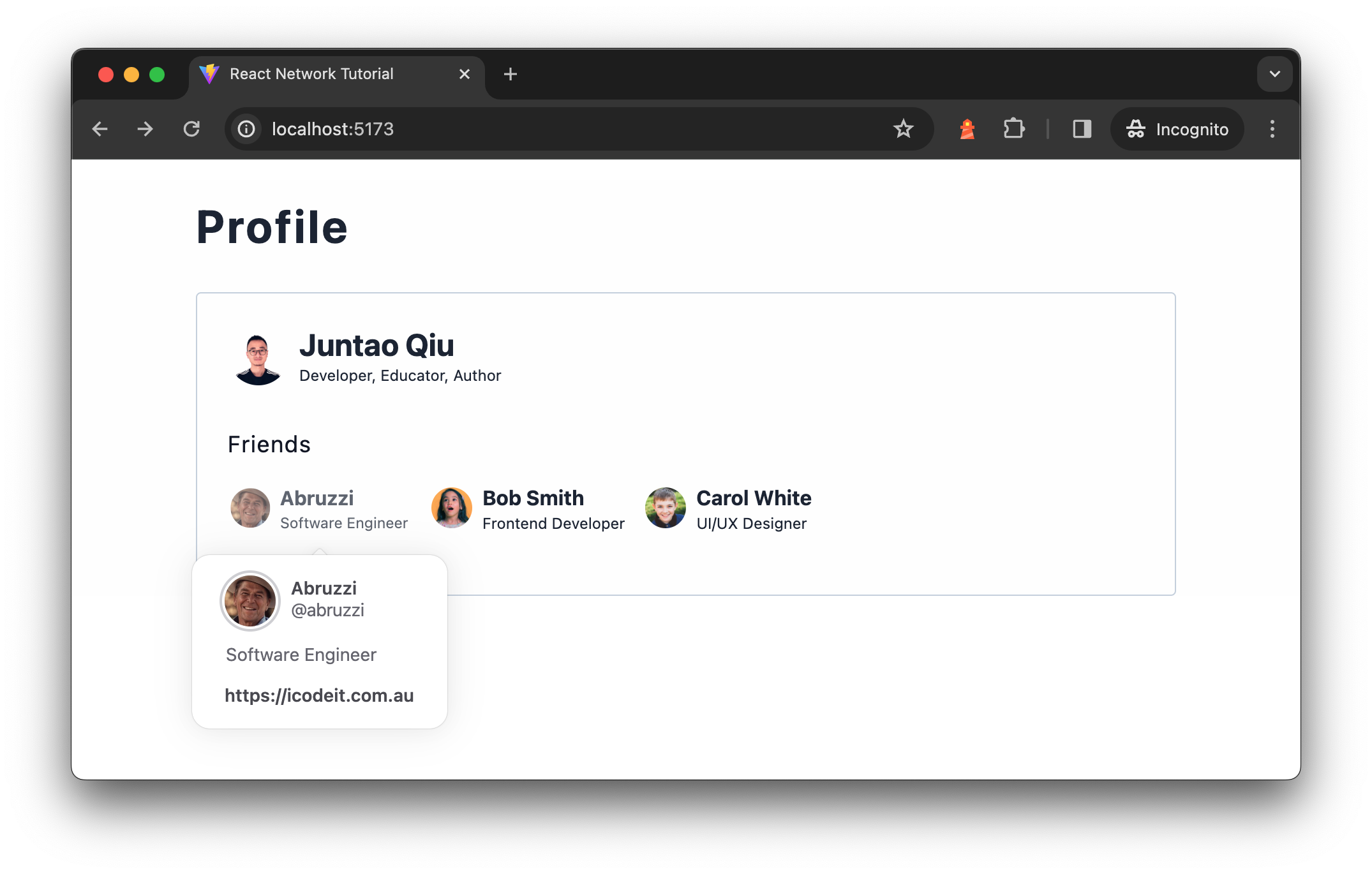
Consider enhancing the current Profile page. Suppose a user clicks on a friend's avatar, and we display a popover with additional details fetched from a /users/1/details endpoint. This feature, common in platforms like Twitter or LinkedIn, adds depth to user interaction.

To maintain focus on our main topic, I'll skip the detailed implementation of the popover itself. Instead, we'll utilize components from nextui for the popover behavior and UserDetailCard.
NextUI is a React UI library built on top of Tailwind CSS and React Aria, offering beautiful and accessible user interfaces. Despite its name similarity and website design, it's an independent community project and is not affiliated with Vercel or Next.js.
Install and config NextUI
Firstly, let's install NextUI into our project:
yarn add @nextui-org/react framer-motionAnd the we will need to edit tailwind.config.cjs
const {nextui} = require("@nextui-org/react");

/** @type {import('tailwindcss').Config} */
module.exports = {
  content: [
    "./index.html",
    "./src/**/*.{jsx,tsx}",
    "./node_modules/@nextui-org/theme/dist/**/*.{js,ts,jsx,tsx}",
  ],
  theme: {
    extend: {},
  },
  darkMode: "class",
  plugins: [nextui()],
}
And finally we'll need to wrap the Application with a NextUIProvider:
import { NextUIProvider } from "@nextui-org/react";

function App() {
  return (
    <NextUIProvider>
      <div>
      <h1>Profile</h1>
        <div>
          <Profile id="u1" />
        </div>
      </div>
    </NextUIProvider>
  );
}
Next let's implement the popover component with Friend.
Implementing a Popover Component
A popover is a non-modal dialog that appears adjacent to its trigger element. It's often used to display additional rich content.
Here's a basic implementation using @nextui-org/react:
import React from "react";
import {Popover, PopoverTrigger, PopoverContent, Button} from "@nextui-org/react";

export default function App() {
  return (
    <Popover placement="right">
      <PopoverTrigger>
        <Button>Open Popover</Button>
      </PopoverTrigger>
      <PopoverContent>
        <div className="px-1 py-2">
          <div className="text-small font-bold">Popover Content</div>
          <div className="text-tiny">This is the popover content</div>
        </div>
      </PopoverContent>
    </Popover>
  );
}
Clicking the "Open Popover" button reveals a popover box to the right. This box contains a header "Popover Content" in bold, followed by a descriptive text. It's styled with padding and font adjustments for better presentation.
Define a Trigger Component
The Friend component can act as a trigger for the popover. We wrap it with PopoverTrigger as follows:
import { User } from "../types";
import { Popover, PopoverContent, PopoverTrigger } from "@nextui-org/react";
import { Brief } from "./brief.tsx";

import UserDetailCard from "./user-detail-card.tsx";

export const Friend = ({ user }: { user: User }) => {
  return (
    <Popover placement="bottom" showArrow offset={10}>
      <PopoverTrigger>
        <button>
          <Brief user={user} />
        </button>
      </PopoverTrigger>
      <PopoverContent>
        <UserDetailCard id={user.id} />
      </PopoverContent>
    </Popover>
  );
};
The Brief component accepts a User object and renders its details:
export function Brief({user}: { user: User }) {
  return (
    <div>
      <div>
        <img
          src={`https://i.pravatar.cc/150?u=${user.id}`}
          alt={`User ${user.name} avatar`}
          width={32}
          height={32}
        />
      </div>
      <div>
        <div>{user.name}</div>
        <p>{user.bio}</p>
      </div>
    </div>
  );
}
A click on the Brief component activates the popover.
UserDetailCard Component (Fetching Data)
UserDetailCard is designed to fetch and display user details. The user detail includes:
export type UserDetail = {
  id: string;
  name: string;
  bio: string;
  twitter: string;
  homepage: string;
};
We use our reusable get function to fetch these details from the /users/<id>/details endpoint:
export function UserDetailCard({ id }: { id: string }) {
  const [loading, setLoading] = useState<boolean>(false);
  const [detail, setDetail] = useState<UserDetail | undefined>();

  useEffect(() => {
    const fetchFeeds = async () => {
      setLoading(true);
      const data = await get<UserDetail>(`/users/${id}/details`);

      setLoading(false);
      setDetail(data);
    };

    fetchFeeds();
  }, [id]);

  if (loading || !detail) {
    return <div>Loading...</div>;
  }

  return (
    <Card shadow="none">
      <CardHeader>
        <div>
          <Avatar
            isBordered
            radius="full"
            size="md"
            src={`https://i.pravatar.cc/150?u=${detail.id}`}
          />
          <div>
            <h4>{detail.name}</h4>
            <p>{detail.twitter}</p>
          </div>
        </div>
      </CardHeader>
      <CardBody>
        <p>{detail.bio}</p>
      </CardBody>
      <CardFooter>
        <div>
          <p>
            <a href={detail.homepage}>{detail.homepage}</a>
          </p>
        </div>
      </CardFooter>
    </Card>
  );
}

export default UserDetailCard;
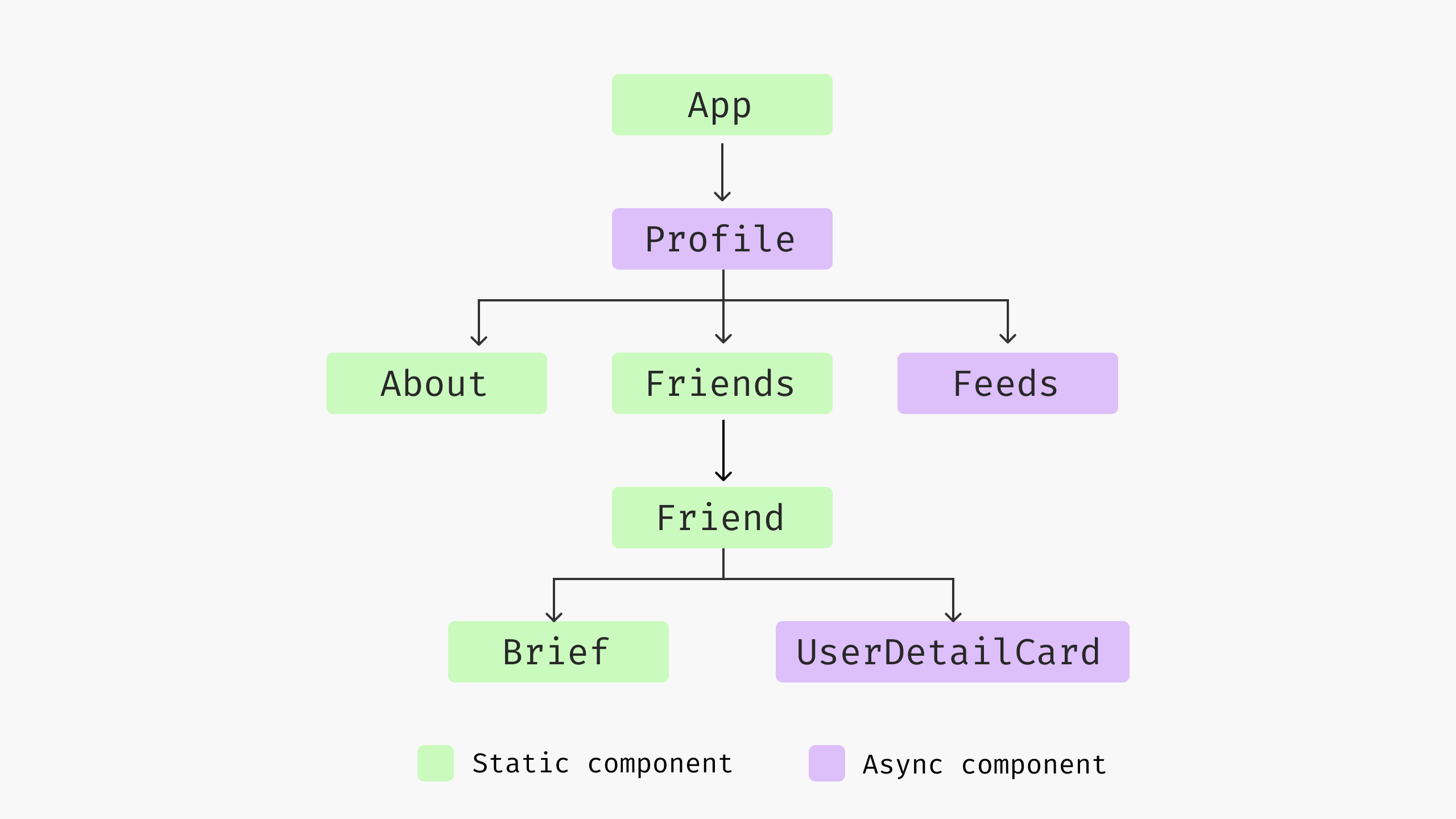
If we could visualise the current component tree

This implementation appears efficient. However, a network inspection reveals increasing data transfer to the client as more third-party libraries are integrated. The additional JavaScript and CSS for the popover and UserDetailCard could be unnecessary for users who don't interact with these features.

Is it possible to delay loading these resources until needed? For instance, only loading the UserDetailCard JS bundle when a user clicks on a Friend avatar, followed by a request to /users/1/details for detailed information. Let's find out in the next chapter.
You have Completed Chapter 4
With the introduction of advanced UI elements and thoughtful data fetching strategies, this chapter elevates the user experience in React applications, paving the way for more engaging and efficient frontend designs.
In the next chapter, we'll dive into code splitting and lazy load to reduce the initial load, that also the foundation of React concurrent we'll learn later.